

CRO Shopify
How to Create High-Converting Shopify Product Pages: The Ultimate Guide 2025
Apr 5, 2025
Table of Contents
Introduction
Why Product Page Optimization Matters for Your Shopify Store
Essential Elements of High-Converting Shopify Product Pages
3.1 Site Speed: The Foundation of Conversion
3.2 Mobile-First Page Layout
3.3 High-Quality Product Photography
3.4 Compelling Product Descriptions
3.5 FAQs to Address Objections
3.6 Guarantees and Warranties
3.7 Social Proof and Reviews
3.8 Strategic Product Recommendations
3.9 Trust Signals and Security Indicators
Real-World Optimization Example: Before and After
Conclusion
Creating a High-Converting Shopify Product Page isn’t just about looks. It’s about making smart, targeted changes that drive sales. In this guide, we’ll cover exactly how to turn your Shopify product pages into powerful conversion tools. In this comprehensive guide, we'll dive deep into creating highly converting Shopify product pages that turn visitors into customers.
By implementing the strategies in this guide, you'll learn exactly how to transform your product pages from average to high-converting money-makers for your store.
Why Product Page Optimization Matters for Your Shopify Store
Your Shopify product pages are the final decision point for shoppers. They act like a salesperson on your website. When optimized for conversion rates, these pages can turn casual visitors into buyers. If not optimized, you may be leaving sales on the table.
Key Elements of High-Converting Shopify Product Pages
1. Site Speed: The Foundation of Conversion
The speed of your page is one of the most important factors for conversion rates. Shoppers expect fast-loading pages. Slow pages lead to higher bounce rates and lower sales. Here are some statistics to prove this point:
70% of shoppers consider load time crucial when shopping online
Just one extra second of load time can decrease conversion rates by 4.42%
The ideal Largest Contentful Paint (LCP) should be under 2 seconds
How to improve your site speed:
Use tools like GT Metrics to test your speed performance
Aim for a speed score of at least 50 (60+ is excellent for larger stores)
Optimize image sizes and implement lazy loading
Minimize the use of apps that slow down your site

Take inspiration from Beard Brand, which maintains a speed score above 60 despite being a large store with multiple apps.
For more info on optimizing your Shopify speed, check out my blog post about speed optimization or this step-by-step video tutorial.
2. Mobile-First Page Layout
With 60% of traffic coming from mobile, mobile optimization is crucial for your Shopify product pages. Use the F-shaped layout that studies show people naturally follow when scanning websites.

Tips for mobile optimization:
Position your most important elements at the top of the screen
Place your CTA button prominently above the fold
Remember that 57% of viewing time is spent above the fold
80% of visitors won't scroll past the initial screen
Lumi sets a good example of mobile optimization with visible product photos above the fold and easy-to-find CTA buttons.

Prominent product photos at the top
High-contrast CTA buttons that are immediately visible
Sticky "Add to Cart" buttons that remain accessible while scrolling
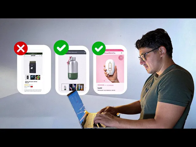
3. High-Quality Product Photography
Up to 90% of online buyers consider photo quality critical when making a purchase decision. Make sure you have clear, high-quality images:
Include at least 8 different photos per product
Show the product from multiple angles
Feature lifestyle images showing the product in use
Avoid generic supplier or stock photos

Sustainable brand Suri nails this by using close-ups and real-world product shots to help customers understand what they’re buying.
4. Compelling Product Descriptions
87% of consumers consider product content as extremely or very important when deciding to buy. Here's how to create descriptions that convert:
Structure for easy scanning:
Use short paragraphs (3 sentences or less)
Implement benefit-focused bullet points
Organize information in collapsible sections
Create a strong value proposition:
Clearly explain how your product solves customer problems
Highlight specific benefits (not just features)
Differentiate your product from competitors
Instead of saying a water bottle is "durable," specify that it "keeps your drinks cold for 24 hours, perfect for staying hydrated during long hikes or busy workdays."
Brands like Dorai Home does this well by showing their products in action and focusing on key benefits.

Demonstrating products in action
Highlighting key benefits like "non-toxic" and "prevents bacteria growth"
Using collapsible sections to provide detailed information without overwhelming the page
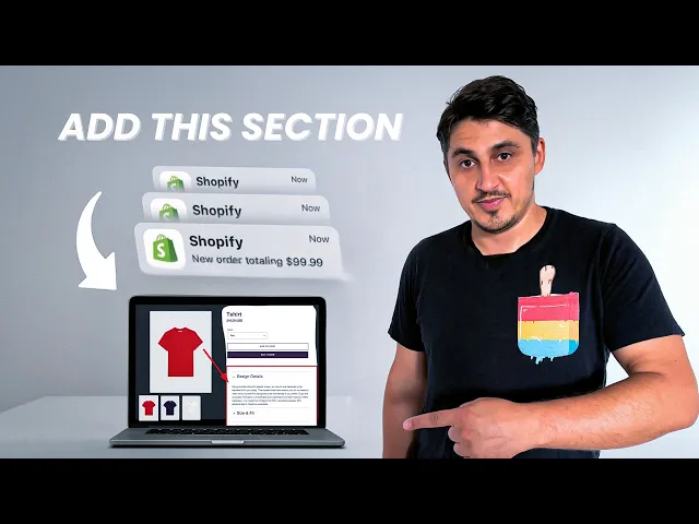
If you're interested in learning more about how to optimize product pages with product tabs/ collapsible sections, check out this blog article or watch this video tutorial.
5. FAQs to Address Objections
Answering customer questions upfront can increase your conversion rates by 75%. Create an FAQ section that covers:
Common product questions
Shipping and return concerns
Product usage and maintenance questions
Compatibility or sizing questions
Lumi's uses FAQs to address common issues like warranty and product results, which helps remove purchase barriers.
6. Guarantees and Warranties
Offering guarantees reduces buyer hesitation and addresses the fear of making a regrettable purchase:
Olipop provides a 45-day money-back guarantee
Clear guarantee policies can significantly boost conversion rates

7. Social Proof and Reviews
Displaying an overall star rating prominently near the top of the page
Showcasing the total number of reviews
Featuring detailed testimonials from real customers
Lumi's highlights their 4.9-star rating and over 1,000 reviews, building immediate credibility.

8. Strategic Product Recommendations
Product recommendations can boost sales by up to 300%. However, don’t overwhelm visitors:
Show a few, highly relevant items.
Position them without distracting from the main CTA.
Barner, uses checkout upsells, offering add-ons like protective cases during checkout rather than cluttering the product page.

9. Trust Signals and Security Indicators
With 17% of abandoned carts due to security concerns, trust signals are key:
Display secure payment icons and SSL certificates
Show recognized industry certifications
Offer familiar checkout options
Highlight free shipping and return policies
The Honeypot adds credibility by featuring media mentions and expert reviews on their product pages.

Real-World Optimization Example: Before and After
Let's examine a real-world product page optimization and the specific changes made for better conversions:

Announcement Bar Optimization
Initially, the bar have been taking up too much space and displaying unnecessary information. In our case, we had a two-line announcement bar that was not efficient. We reduced it to just one line, removed unnecessary quotation marks, and bolded the coupon code to make it stand out more. This small tweak helped streamline the layout and made the bar more visually appealing.
Before: Two-line announcement with unnecessary quotation marks
After: Single-line announcement with bolded coupon code for emphasis
Product Image Improvements
White space is great, but too much of it can waste valuable screen space that could be used for more important content. So we minimized the excessive white space around the product images, allowing more room for other key elements on the page. We also added arrows to the product images to make navigation easier. Customers can now switch between images with a simple click, making their browsing experience more intuitive.
Before: Excessive white space and no navigation arrows
After: Maximized image size and intuitive navigation arrows
Review Enhancement
Customer reviews are crucial for building trust. The original reviews on this page were vague, just showing numbers without much context. To make them more credible, we added specific details, like the exact rating and the number of happy customers. This simple change boosts the credibility of the reviews and gives potential buyers more confidence in their purchasing decision.
Before: Vague review numbers
After: Specific rating (4.8/5) and number of customers (1,200+)
Benefit-Focused Headlines
Headlines are the first thing visitors see when they land on a product page, so it’s important to make them count. Previously, our product headlines were pretty generic. We revamped them to highlight the key benefit of the product. For example, instead of just naming the product, we now say something like “Never Lose Your Wallet Again.” This approach immediately communicates the value of the product and what the customer will gain from purchasing it.
Before: Generic product name
After: Benefit headline: "Never lose your wallet again"
Clearer Sale Communication
Nothing frustrates customers more than unclear sales communication. Instead of simply saying "Sale," we specify the exact discount percentage, like “Save 20%.” This clarity reduces friction in the buying process and helps customers make faster purchasing decisions, knowing exactly how much they’ll save without having to do any math.
Before: Generic "Sale" tag
After: Specific "Save 20%" message
Streamlined Content and Removed Unnecessary Elements
Less is more when it comes to your product page. We removed elements like the “Selling Fast” tag, which can often come off as spammy. We also eliminated the opening copy that focused too much on the company, like “Our high-quality leather…” Customers don’t care about your company—they care about what the product can do for them. Starting with their needs first makes the message more compelling.
Before: Company-focused opening copy After: Customer benefit-focused content
Improved Product Options
Small details matter! We made the color swatches bigger and placed them closer to the product image for better visibility. This makes it easier for customers to choose different product options without scrolling up and down. We also bolded the “Add to Cart” button and added trust badges like “Secure Payments” and popular card brands to boost credibility.
Before: Small color swatches far from product image
After: Larger color options positioned closer to the product image
Trust Enhancement
Trust is a crucial element in converting visitors into customers, especially in the e-commerce space. If your customers don’t feel secure, they won’t complete the purchase. Before, our product page had no visible trust indicators, which could make customers hesitant. To address this, we added payment security badges like “Secure Payments” and well-known credit card brands (e.g., Visa, MasterCard). These badges immediately reassure customers that their payment information is safe.
Additionally, we highlighted the 2-year product guarantee near the "Add to Cart" button. Offering a clear and visible guarantee adds extra confidence to potential buyers, knowing they can trust your brand to stand behind its products.
Before: No visible trust indicators
After: Added payment security badges and highlighted 2-year guarantee
8. Description Organization
To prevent your product page from becoming overwhelming, we moved the product description to a separate section. Now, customers can click on the description to view more details like product features, without distracting from the main call-to-action. This keeps the focus where it should be—on the “Add to Cart” button.
Before: Long, overwhelming product description
After: Collapsible sections for organized, scannable information
These surface-level changes can have a massive impact on your store's conversion rate. A few small tweaks here and there can lead to increased sales and a more streamlined, user-friendly experience for your customers.
In addition to these optimizations, consider adding upsell options like gift boxes or "Buy Two, Get a Better Price" offers to boost your average order value. If you’re looking for a more in-depth guide on how to implement these conversion rate optimization strategies on your Shopify store, I’ve created a detailed video tutorial that walks you through each step of the process, showing you exactly how to make these changes on your own store.
Conclusion
Creating high-converting Shopify product pages is about understanding your customers. Use the tips in this guide to boost conversion rates, improve your site speed, and optimize for mobile. Small changes can make a big difference in turning visitors into customers.
Don’t forget, A/B testing is also a great way to find what works best. Testing different page elements can help you increase Shopify conversion rates over time.
